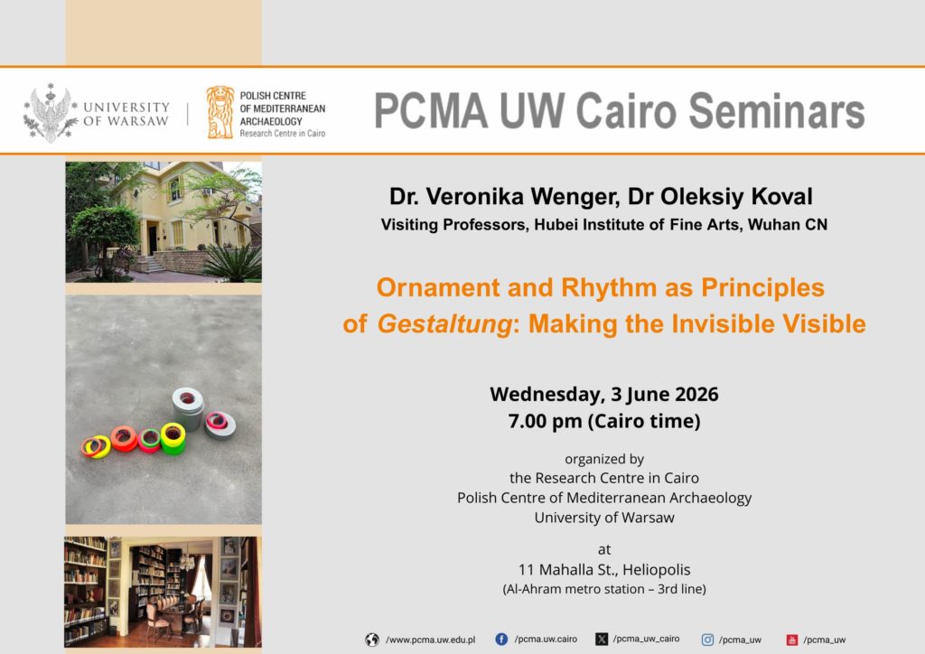
The PCMA UW Cairo Seminars at the PCMA Research Centre in Cairo, June 3rd, 2026
The Research Centre in Cairo
Polish Centre of Mediterranean Archaeology University of Warsaw
June 3, 2026
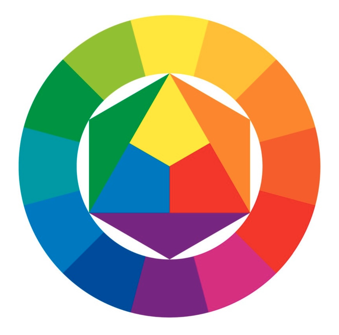
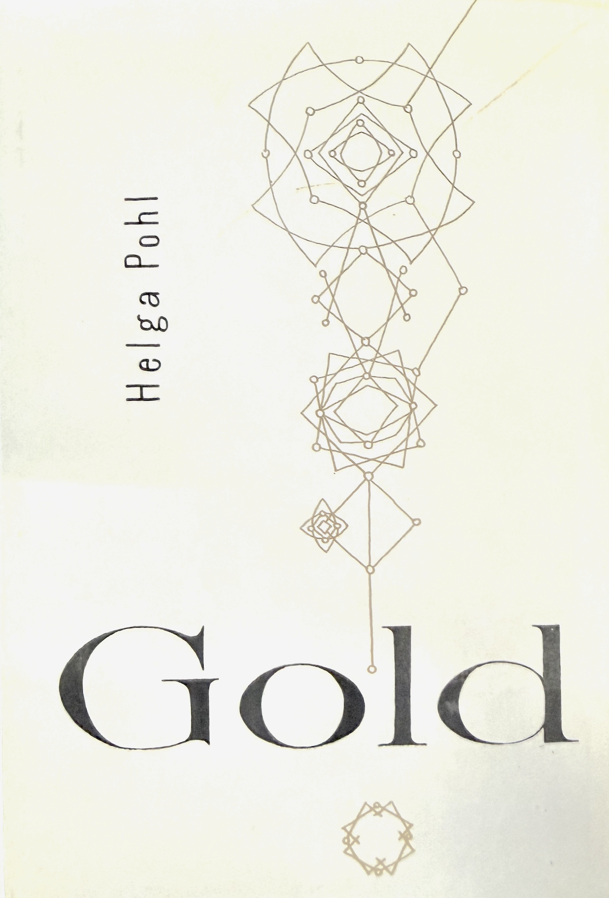
Ornament and Rhythm as Principles of Gestaltung: Making the Invisible Visible
The Beautiful Formula
by Oleksiy Koval
around 1930 (BHA)
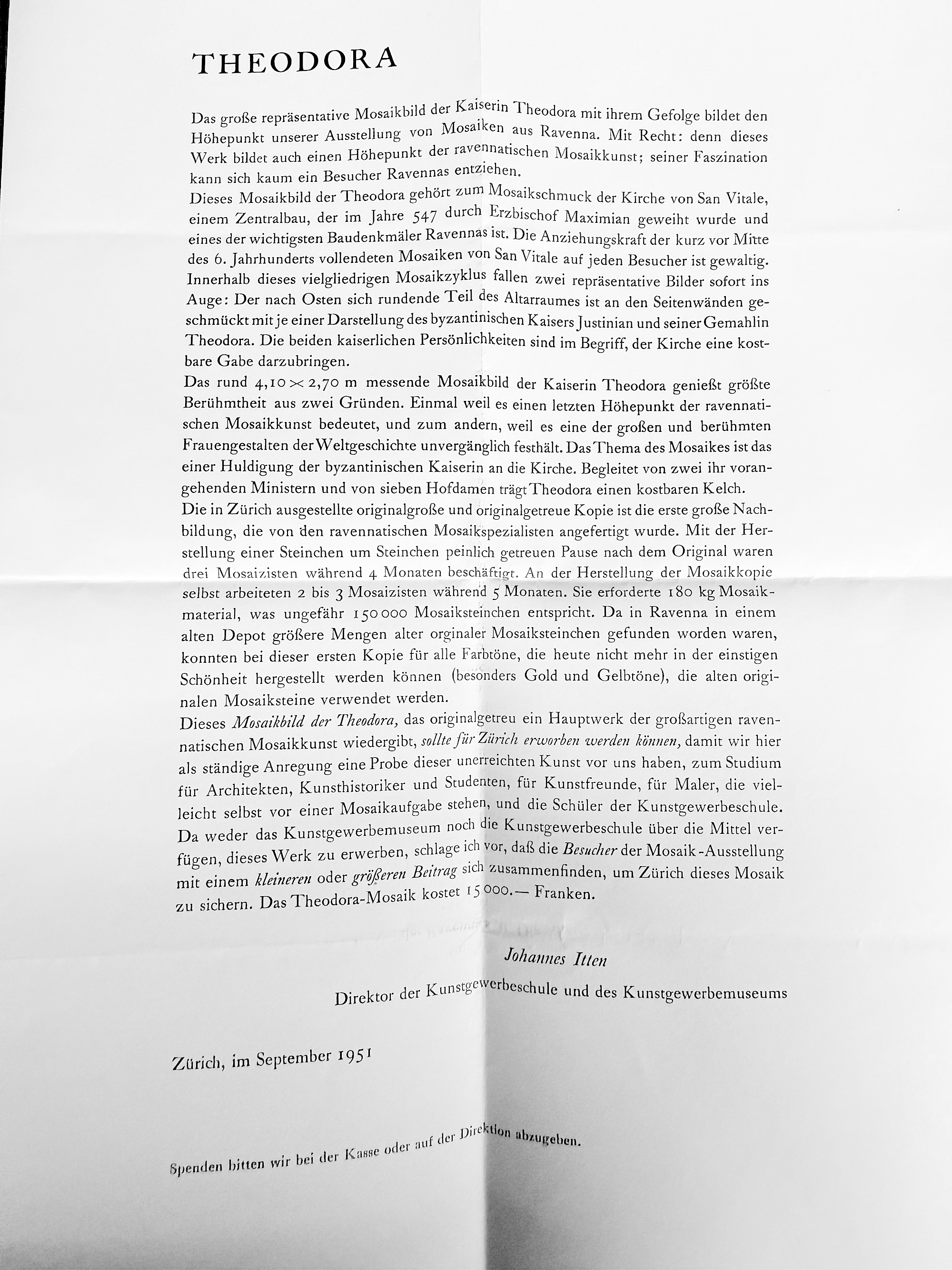
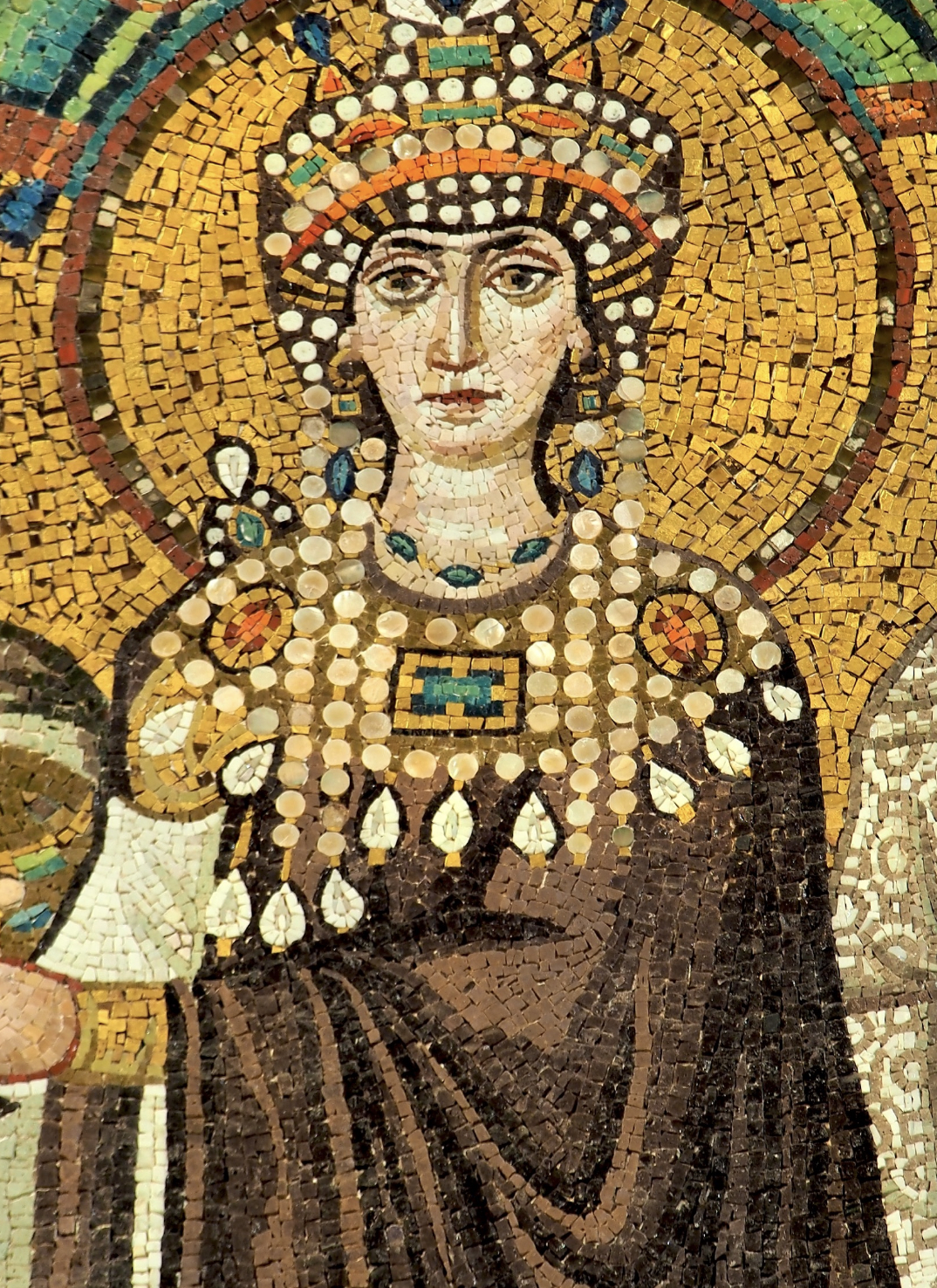
Johannes Itten, a Swiss painter, art theorist, art educator, and teaching master at the Bauhaus, appeals for donations in September 1951 as Director of the School of Applied Arts and the Museum of Applied Arts in Zurich, to acquire a mosaic copy from Ravenna for the sum of 15,000 francs:
by Johannes Itten, Zurich 1951
Sitterwerk Foundation Library, St. Gallen
“This mosaic of Theodora, which faithfully reproduces a major work of the great Ravennate mosaic art, should be acquired for Zurich, so that we may always have before us, as a constant source of inspiration, an example of this unsurpassed art — for the study of architects, art historians, and students; for lovers of art; for painters who may themselves face a mosaic commission; and for the students of the School of Applied Arts.”
The man who formulated the colour theory of the twentieth century calls a work of the sixth century “unsurpassed”. Why?
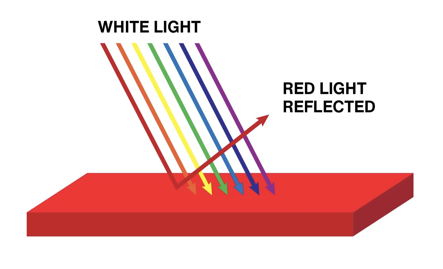
The waves of the visible spectrum fall upon the surface of a material and are absorbed and reflected.
Our eyes and brain perceive this event as the colour of an object.

Standard commercial white paint reflects approximately 80–90% of sunlight, while a specially developed white can reach 98.1%. Fresh, uncorroded silver reflects over 99.5% of visible light.
South Australia
Gold, however, is not a neutral mirror like silver — it reflects visible light in a spectrally selective manner.
It absorbs shorter wavelengths more strongly, while longer wavelengths are reflected more readily.
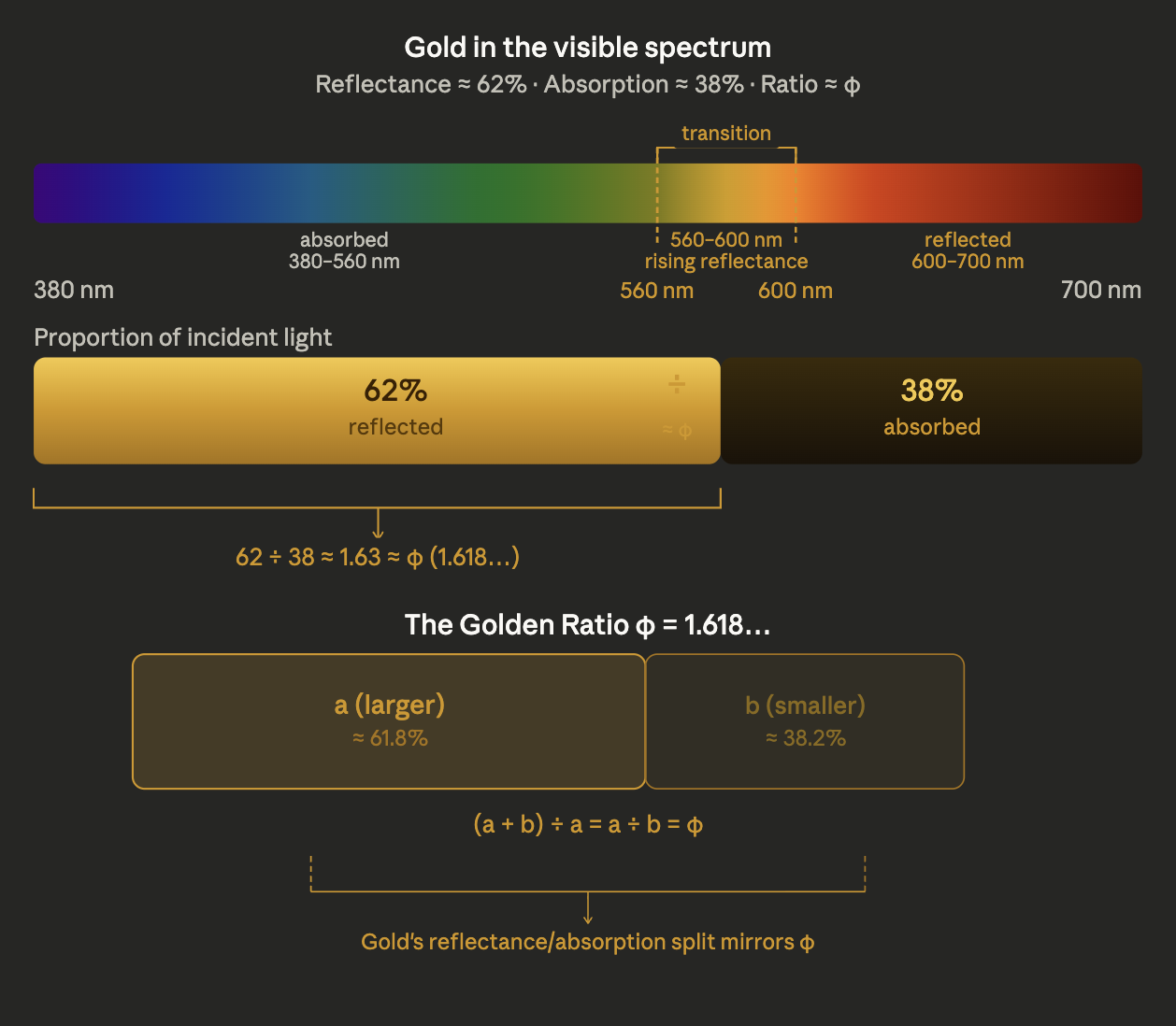
In the visible range, the reflectance of gold can be approximated at around 60–65%.
The ratio of reflected to absorbed light — approximately 62% to 38% — falls within the range of the Golden Ratio.
Sitterwerk Foundation Library, St. Gallen
All colours of the visible spectrum can be found in the sky and on the earth. Gold is visible only on the earth. Gold stands for value, light, permanence, and prestige; these associations shape our emotional response to gold-coloured surfaces.
Johannes Itten (1916)
Kunsthaus Zurich
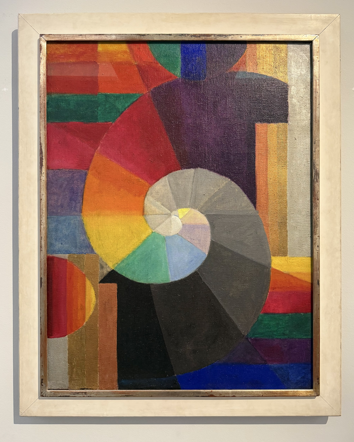
The painting “Encounter” of 1916 by Johannes Itten is on display at the Kunsthaus Zurich. One can see that in this painting Itten worked with various tonal gradations of gold and silver. Gold and silver are used here not as symbol or decoration within the picture plane, but as colour tones within the colour space of the painting.
Basilica of San Vitale (built A.D. 547), Ravenna
Three years later, Itten published his colour theory during his time at the Bauhaus. And this colour theory contains neither gold nor silver. The colour space of the Byzantine mosaics, however, does!
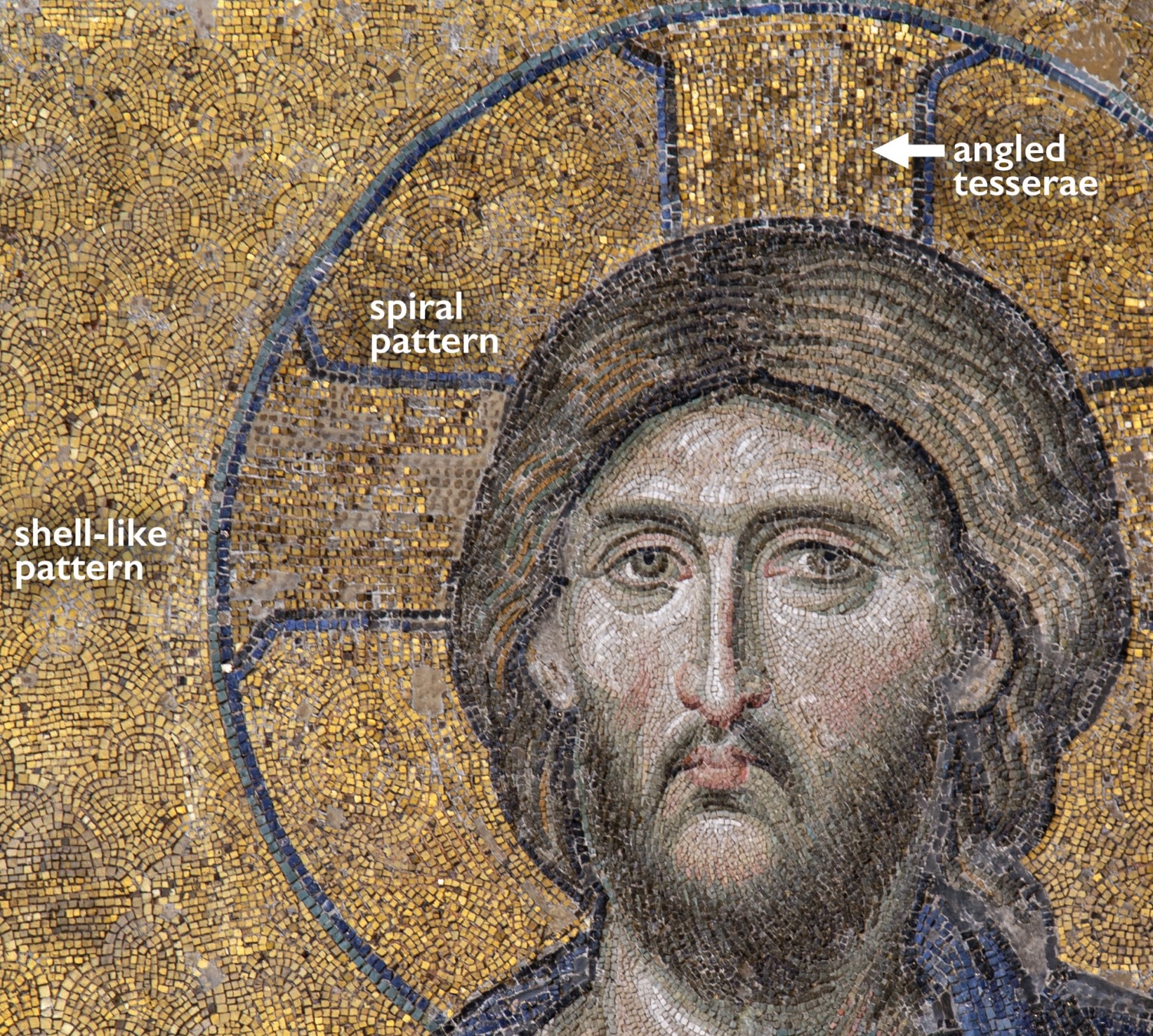
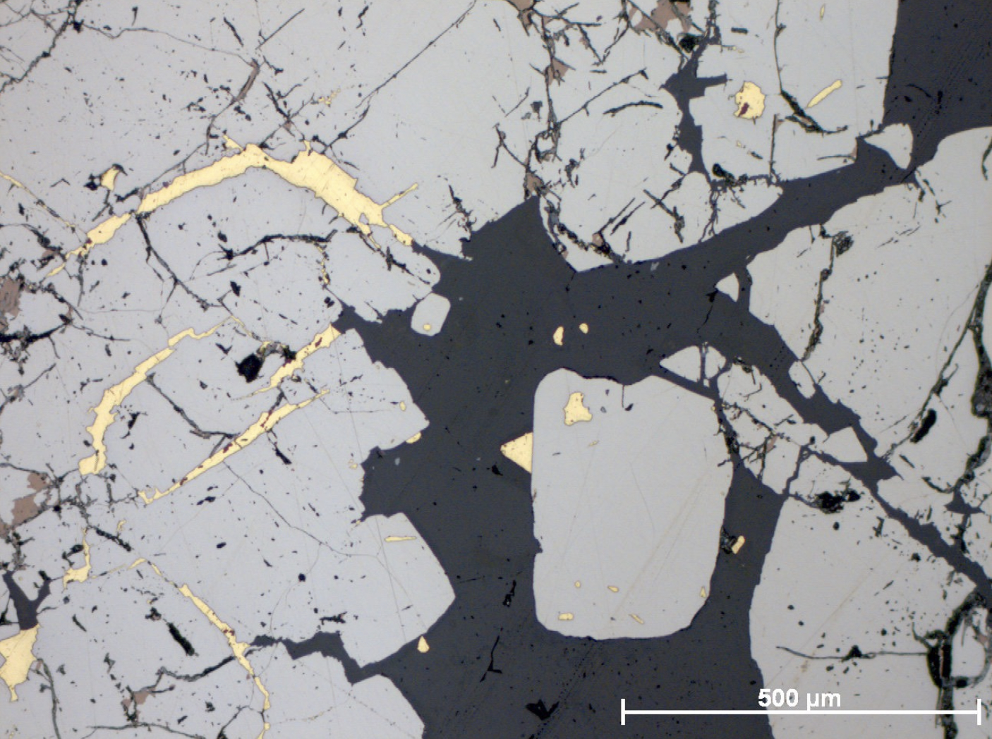
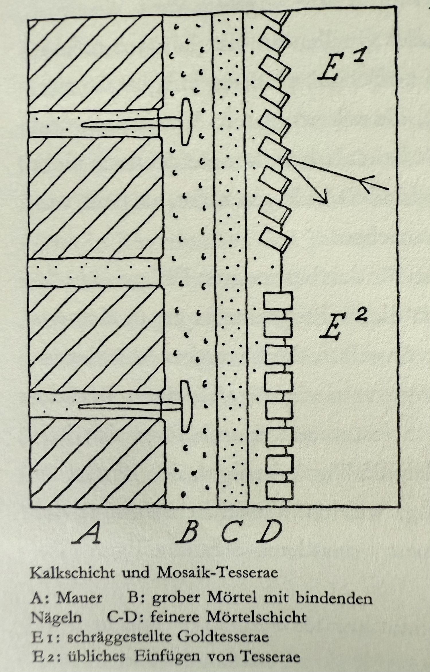
The golden nimbus, for example in the Pantokrator (Deesis Mosaic, Hagia Sophia, South Gallery, ca. 1261), is not uniformly flat, but structured in concentric lines — often composed of slightly varying rows of tesserae that encircle the circular form. This is a direct application of the Opus Vermiculatum principle to the nimbus: the tesserae follow the curved contour. In Byzantine gold mosaics in general — and in the Hagia Sophia in particular — the back-ground tesserae do not run in straight horizontal rows, but frequently in gently curving, concentric arcs that radiate outward from the figure — almost like invisible waves.
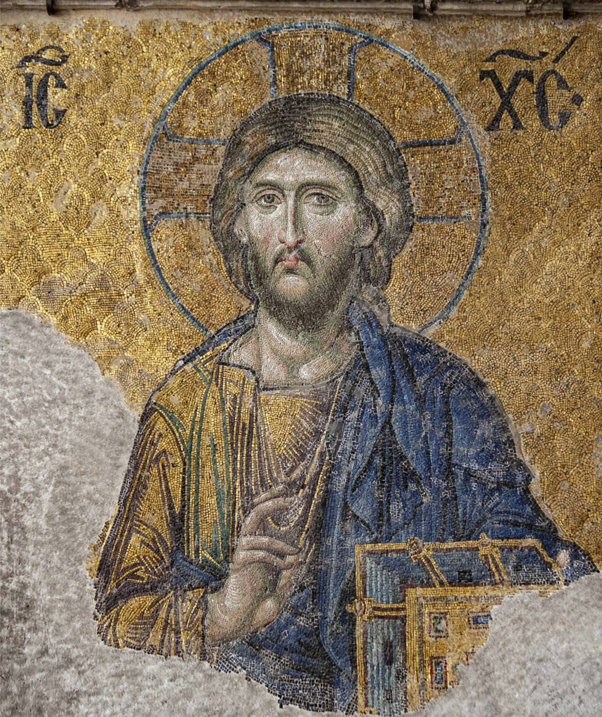
This creates a rhythmic pulse within the homogeneous gold. The systematically varying tilt of the tesserae produces a pulsating effect across the gold surface in shifting light — strictly speaking, a temporal rhythm activated by the viewer.
Thus, three levels of rhythm emerge:
Hagia Sophia, Constantinople (Istanbul).
Photo: byzantologist
I. Concentric arcs.
The background tesserae do not run in straight horizontal rows, but in gently curving, concentric arcs that radiate outward from the figure — almost like invisible waves or the rings of a tree.
II. Systematically varying tilt angle.
No gold tessera lies flat. Each one is individually tilted — to the left, to the right, upward. The result: in shifting light — the movement of the sun throughout the day, the movement of the viewer — the gold surface begins to pulse.
Hagia Sophia, Constantinople (Istanbul). Photo: byzantologist
III. The rhythm of the viewer: activation through movement.
The Byzantine mosaicists composed for the moving viewer. The arc patterns within the gold cannot be experienced statically — they unfold in the time it takes to walk through the space.
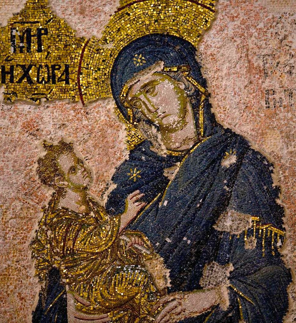
In both the Hagia Sophia and the Chora Church, gold is not merely a background, but a colour tone that interacts with other colour tones on the surface — bound together through the rhythm of the tesserae.
The paradoxical effect: transcendence is brought into immanence — the divine appears in the earthly. Formally, this corresponds to the flatness of the mosaic:
like good painting, the mosaic refuses the illusion of depth. Gold is not a window onto the beyond, but a colour tone on the surface — and precisely in this way the transcendent becomes visible, rather than merely depicted.
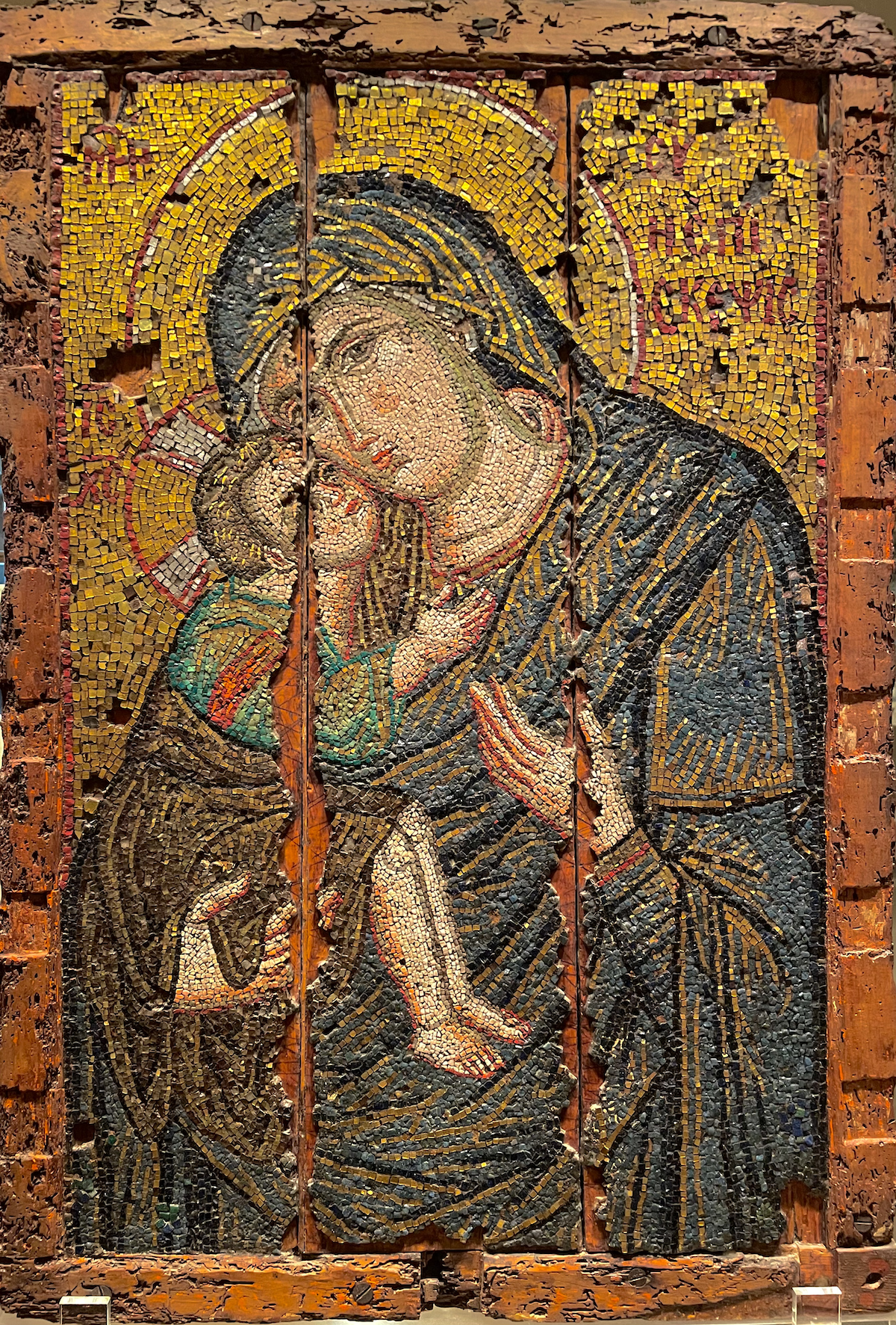
Details “Enthroned Virgin and Child”, dated in 867. Benaki museum, Athens
The rhythm of the tesserae is the unifying principle: it makes gold part of the chromatic structure, not an exception to it.
In his work “Encounter”, Johannes Itten fills in a thoroughly rhythmic arrangement of various forms with various colour tones.
In the Byzantine mosaics, by contrast, forms and colours emerge through the rhythm of application and modulation.
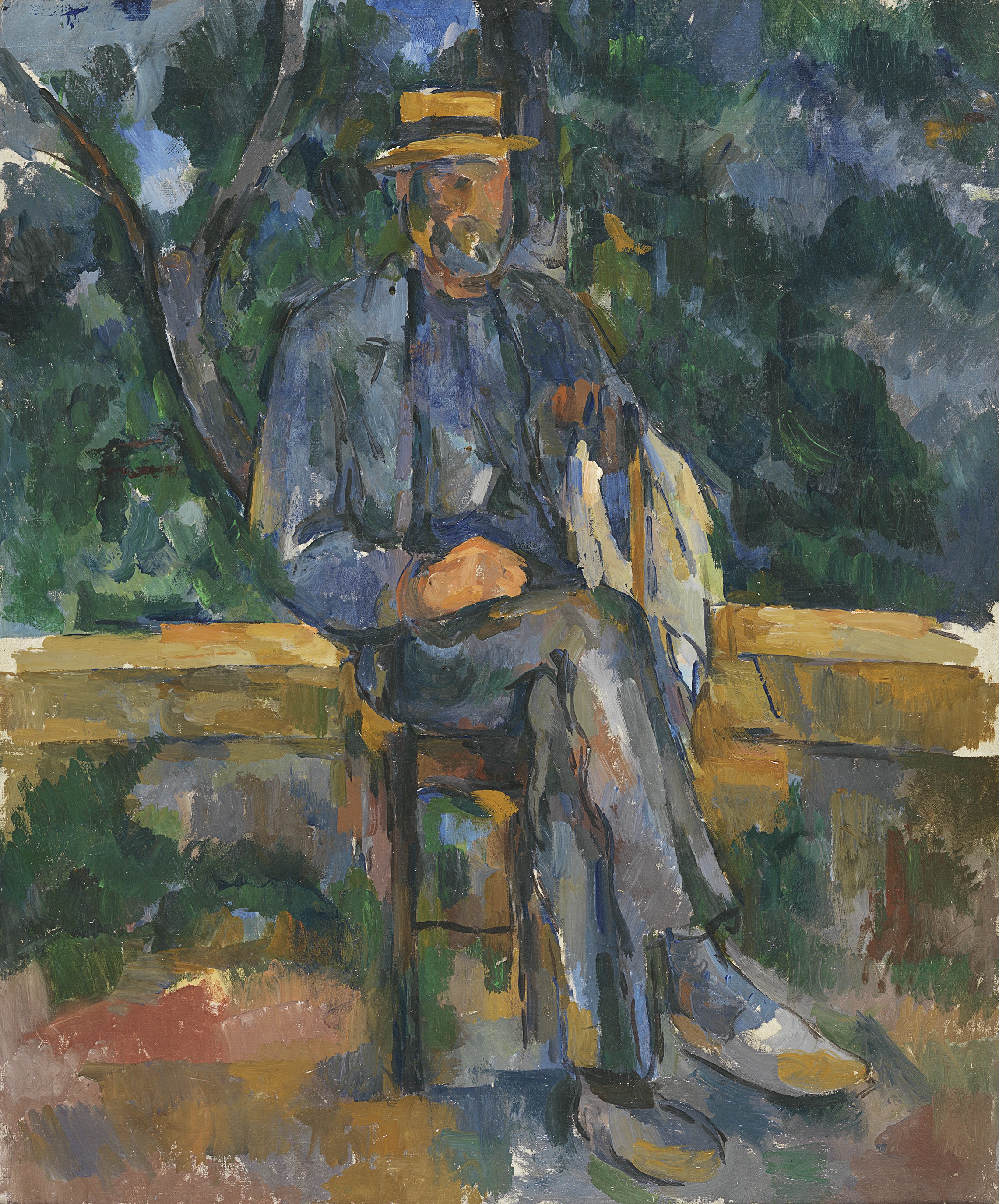
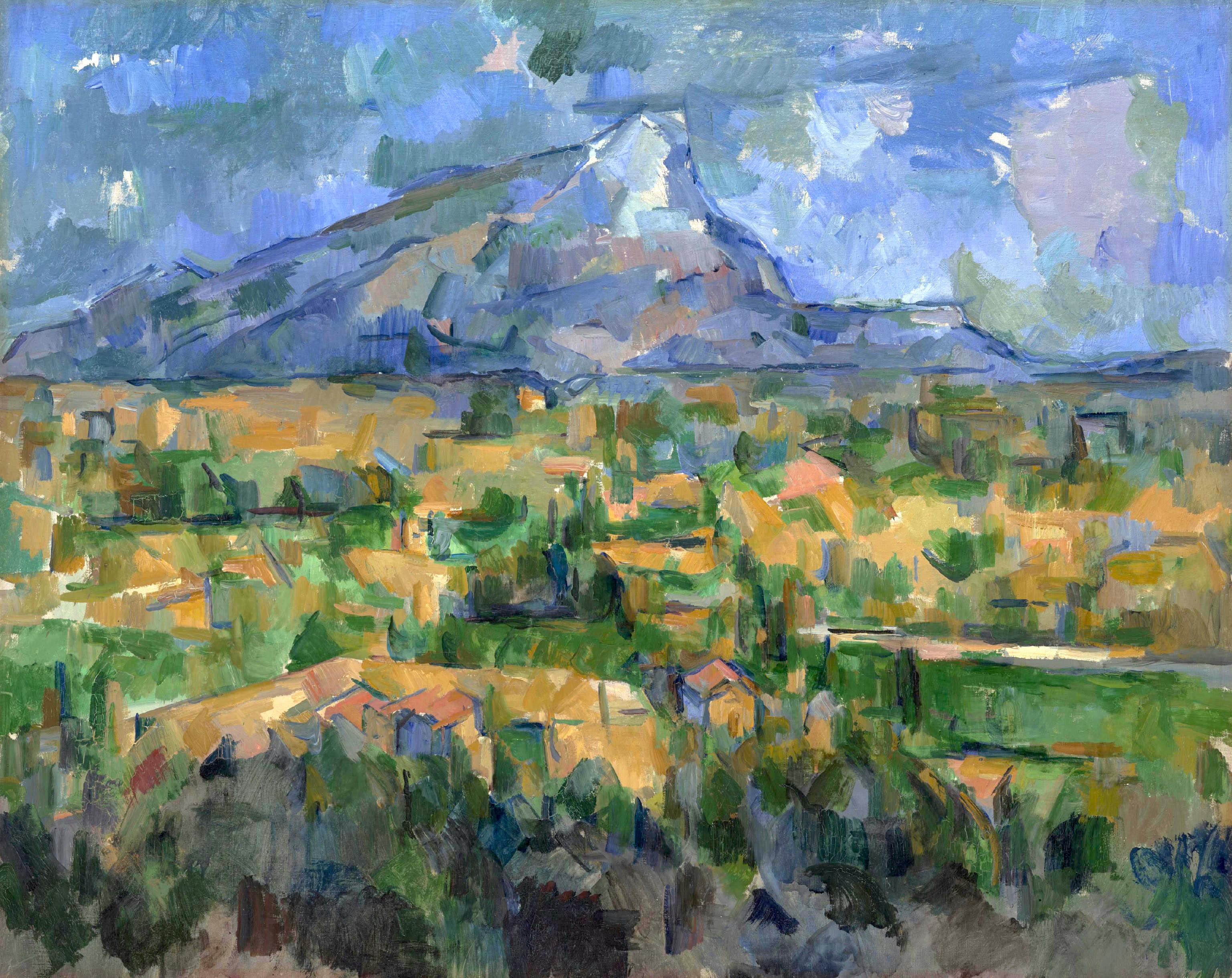
Paul Cézanne 1905-1906
Musée Thyssen-Bornemisza, Madrid
“There is no line, there is no modelling, there are only contrasts. These contrasts are not created by black and white, but by colour sensation. The modelling emerges from the precise relationship of the tones to one another. When they are placed harmoniously side by side and all are present, the painting models itself. One should not say ‘modelling’, one should say ‘modulating’.”
Paul Cézanne,
from the conversations with Joachim Gasquet
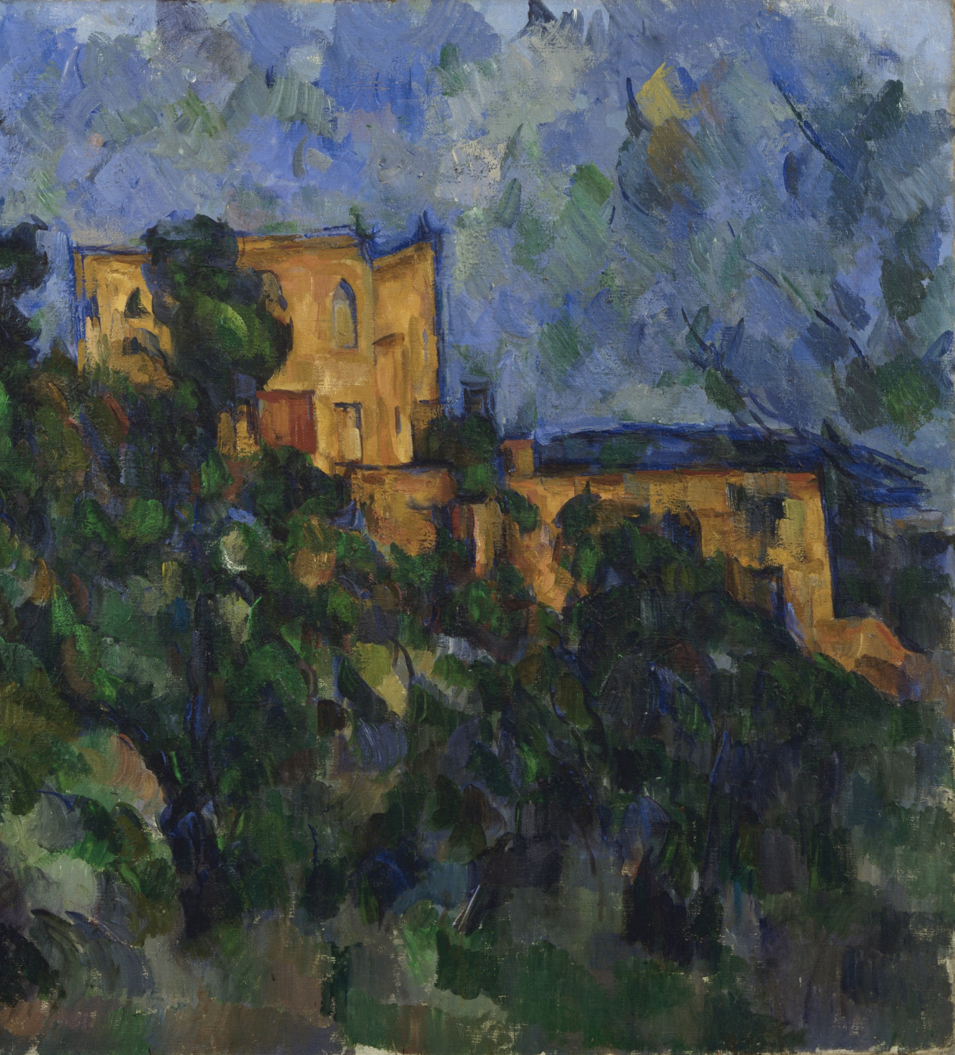
Paul Cézanne 1904
Philadelphia Museum of Art
“Modulating” means that colours do not act merely in a colouristic sense, but shape form through the very act of modulation.
Paul Cézanne 1903
Museum of Modern Art, Manhattan, New York
Just as in Opus Vermiculatum and Opus Tessellatum of Byzantine mosaic art, modulation establishes a relationship between colour tones on the surface — so that there is no foreground or background — the painting of Cézanne, particularly between 1900 and 1906, follows a comparable logic of Opus Vermiculatum, Opus Tessellatum, modulation and rhythm to that of the Byzantine mosaics.
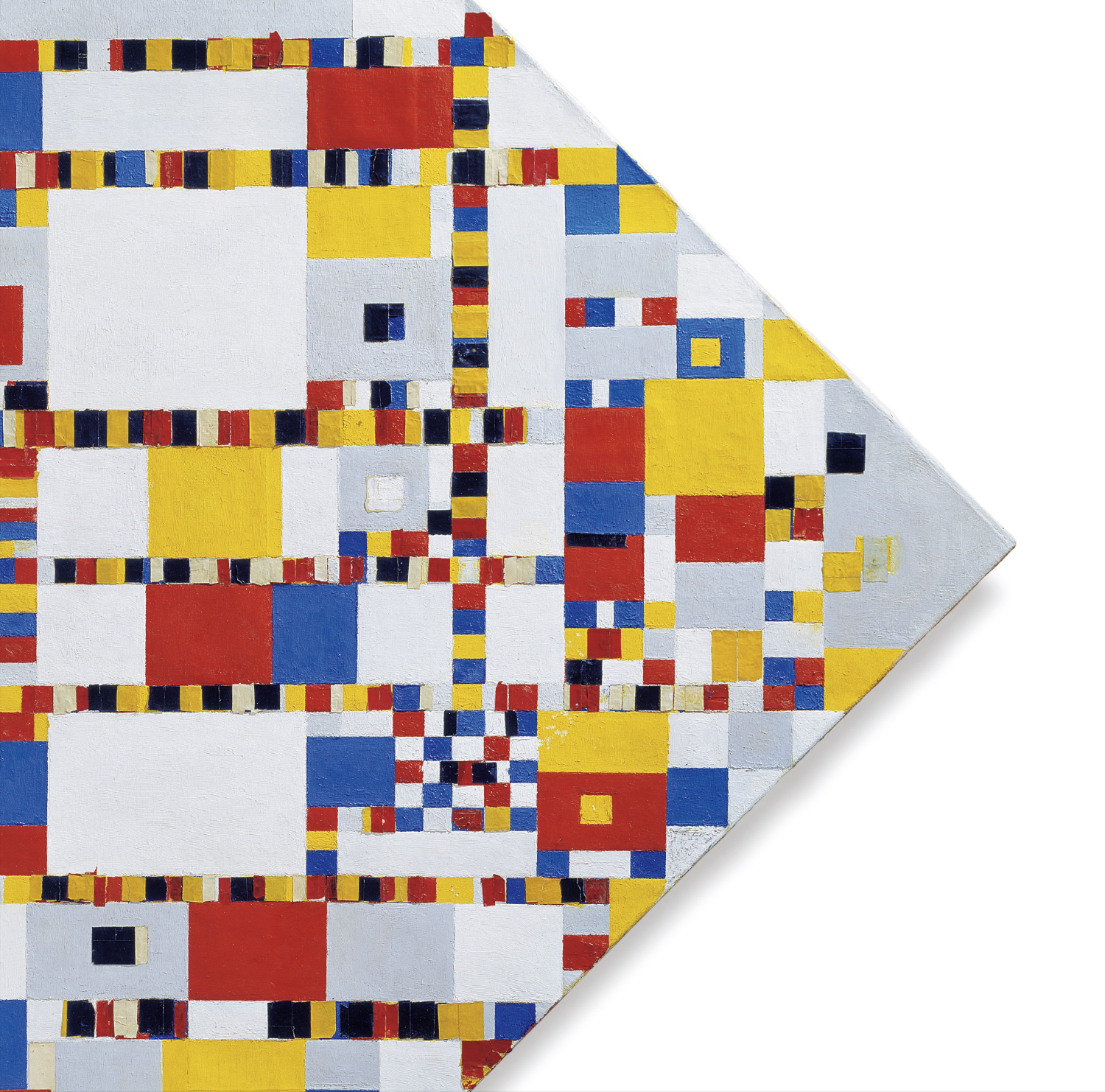
Piet Mondrian 1944
Gemeentemuseum Den Haag
And what is rhythm in painting?
Painting is the application of colour(s) by hand or some tool to a surface.

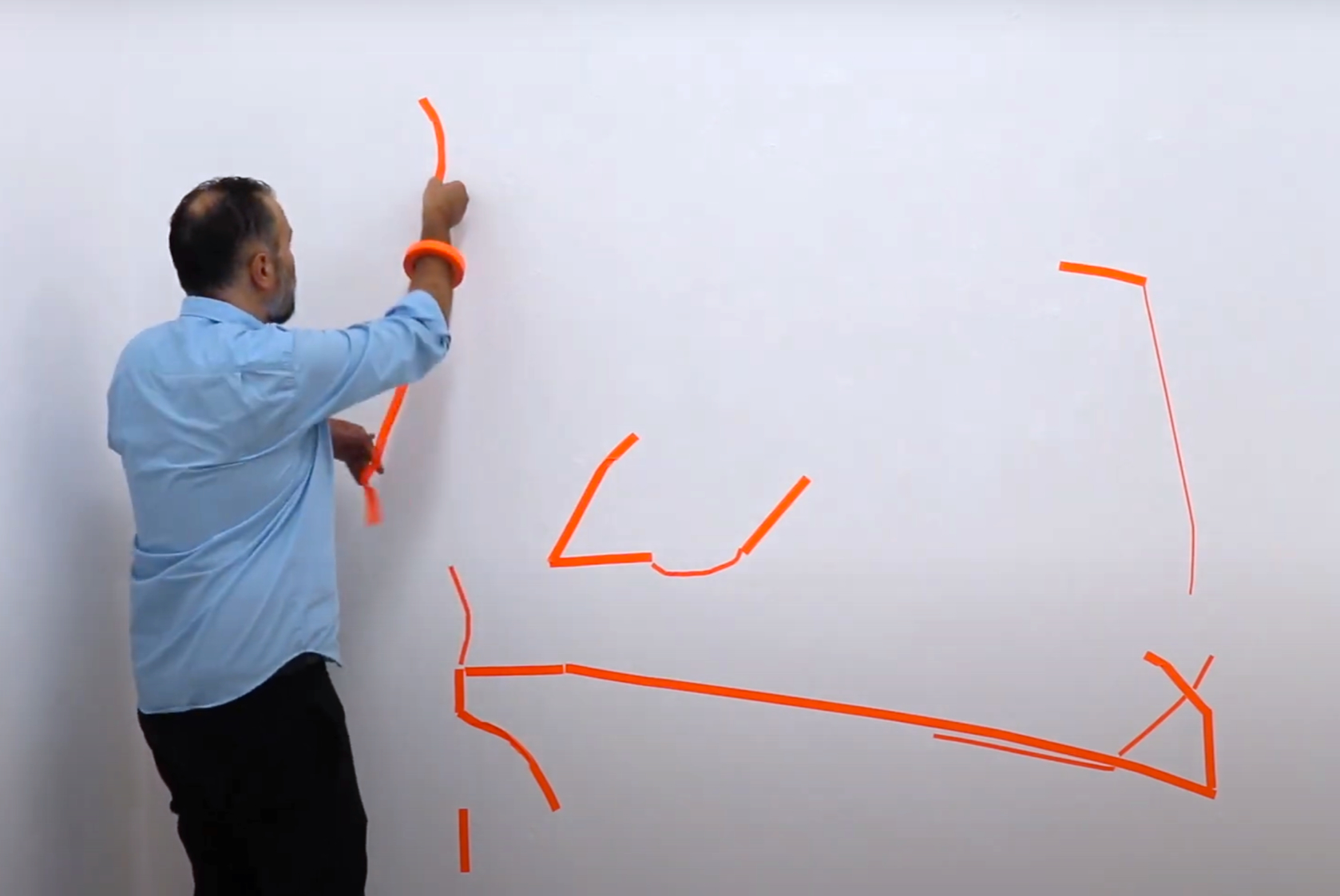
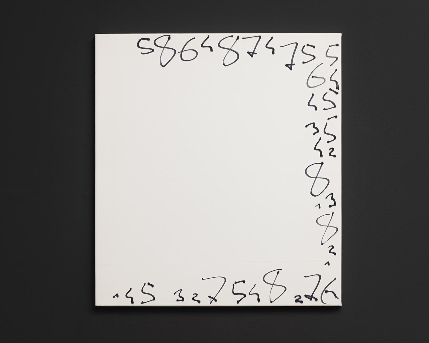
Oleksiy Koval, 2025
75 x 50 cm, marker, ink on PVC
That is, a painter deals with colour, surface, and movement.
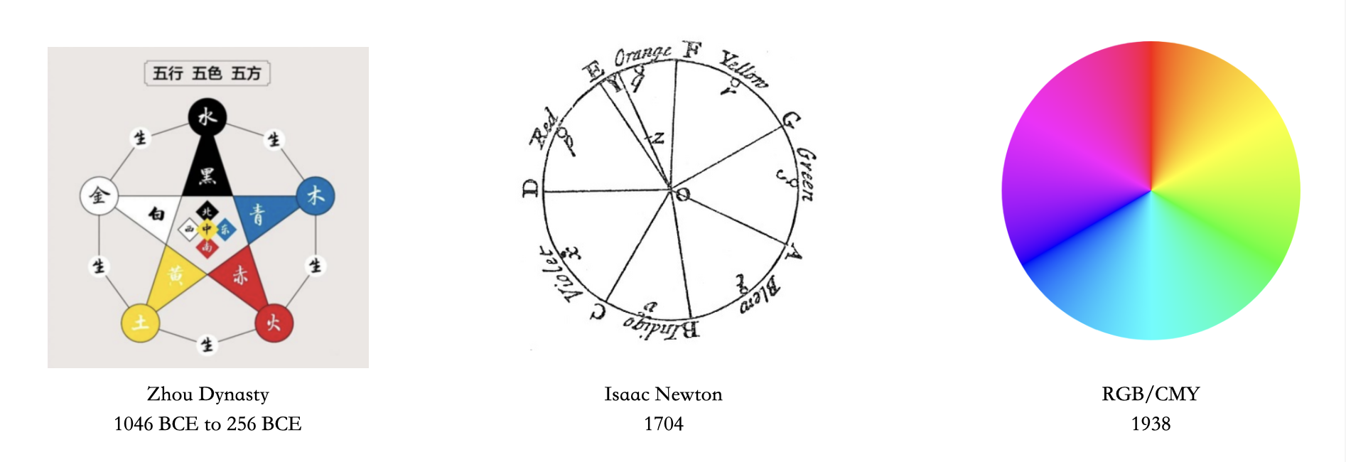
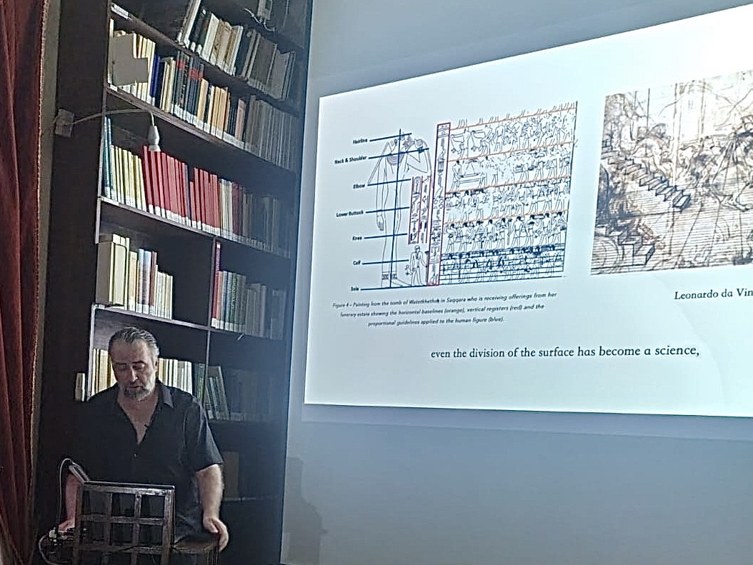
We now know countless colour systems,
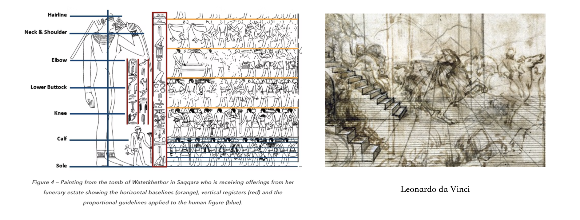
even the division of the surface has become a science,
but the movement in painting remains “an unexplored forest”.
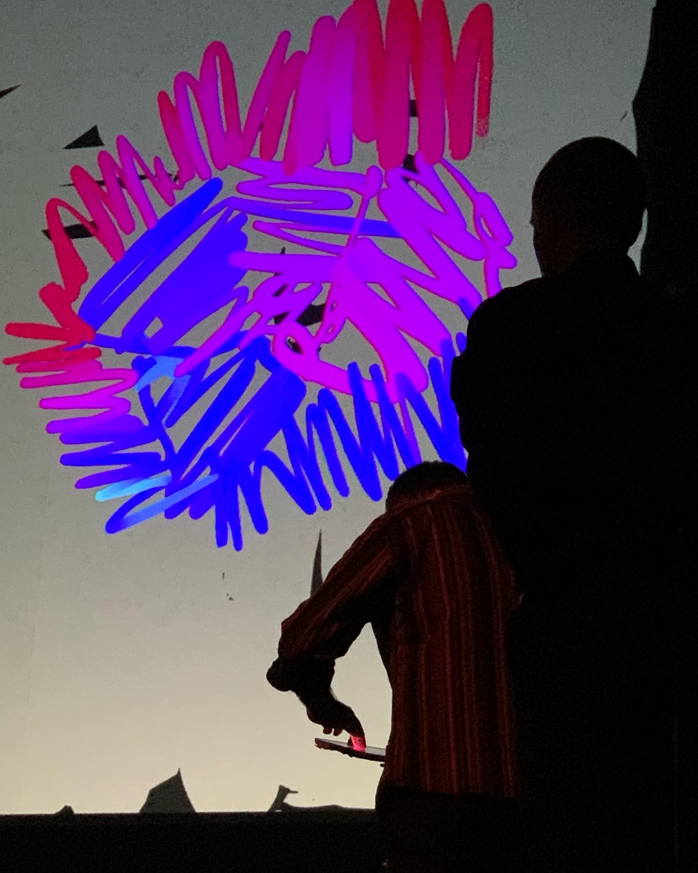
Photo: Susanne Unger
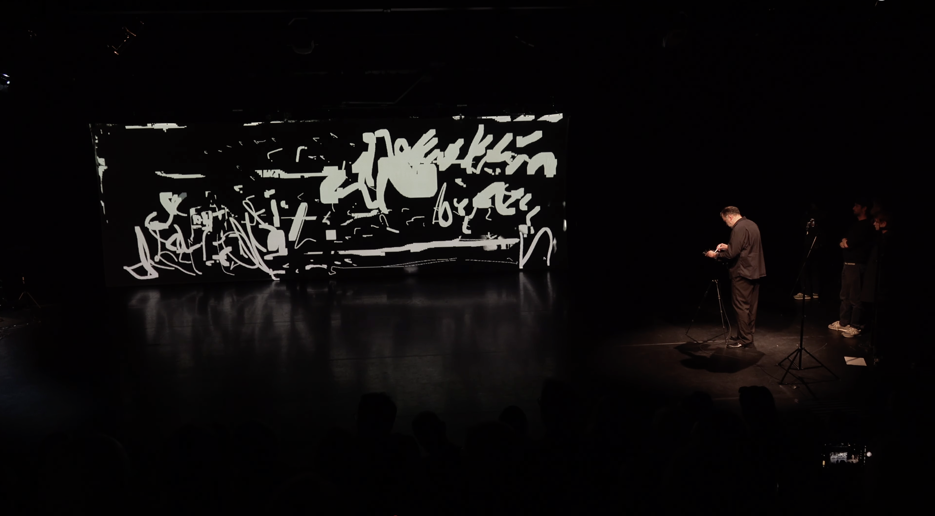
The movements one after the other in time and side by side on the surface were and are my guidelines in painting to this day.
Oleksiy Koval, 2025
Digital Art Space, Munich
At the age of 17, I didn’t really know it yet, but I experienced the rhythm of applying colours intensely for the first time.

Oleksiy Koval, 2025
Boxes Art Museum, Shunde
In my mid-20s, I realized that rhythm gives form to the application of colour.
D_Lab Dingfeng, Guangzhou. Photo: Ma Chunbo
The rhythm brings out the primary qualities of painting.
If the rhythm of the colour on the surface is right, the painting is right.
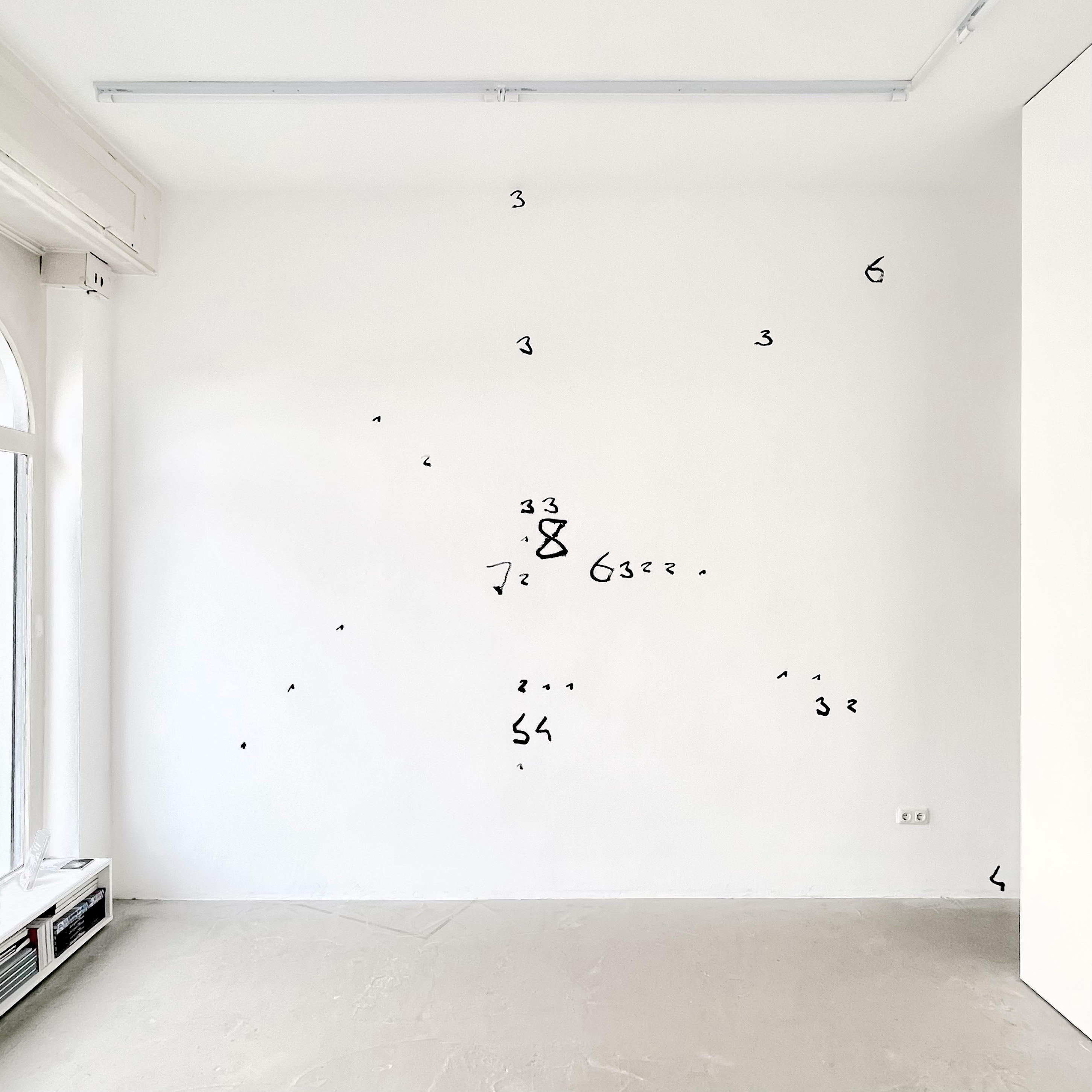
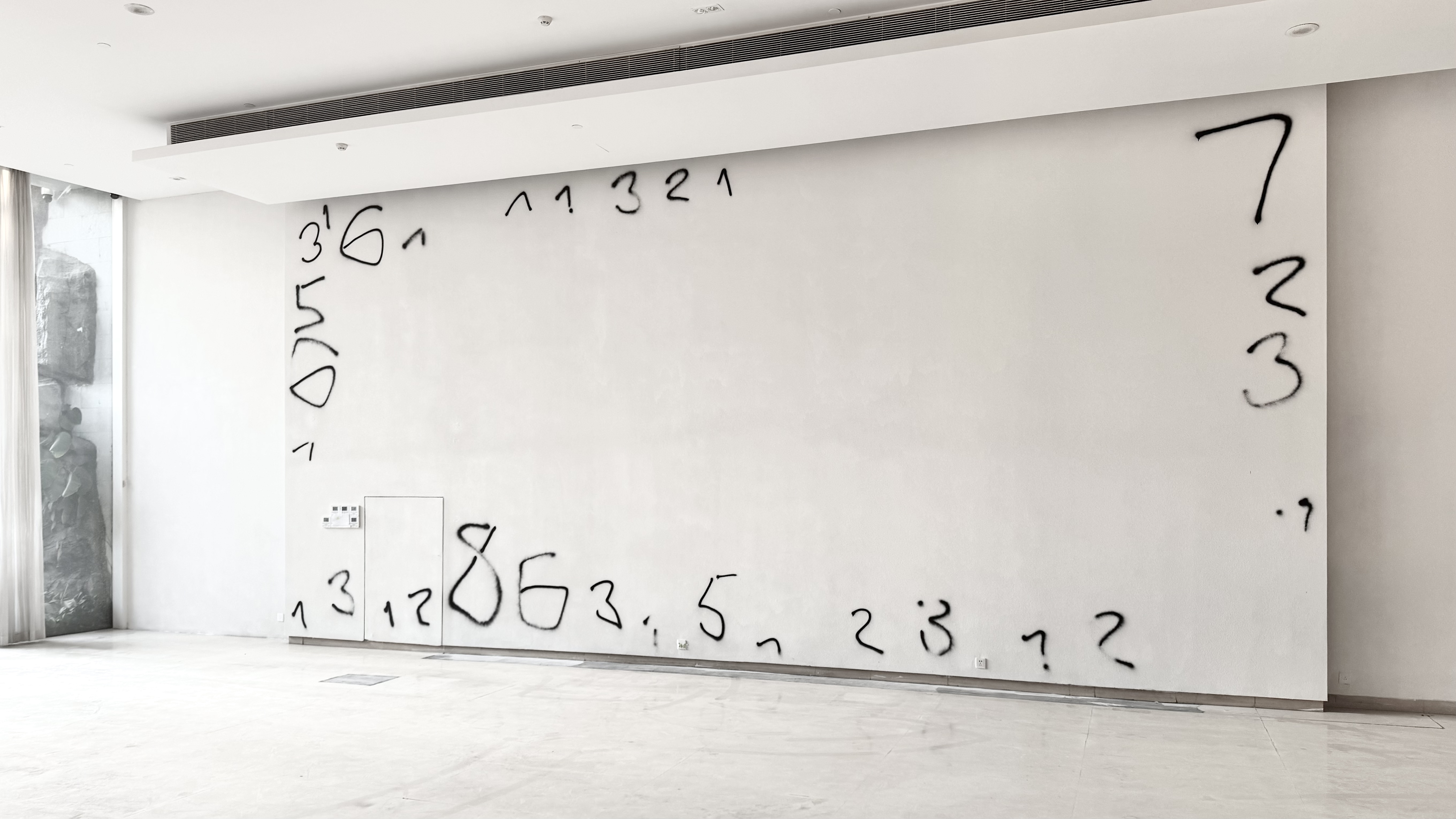
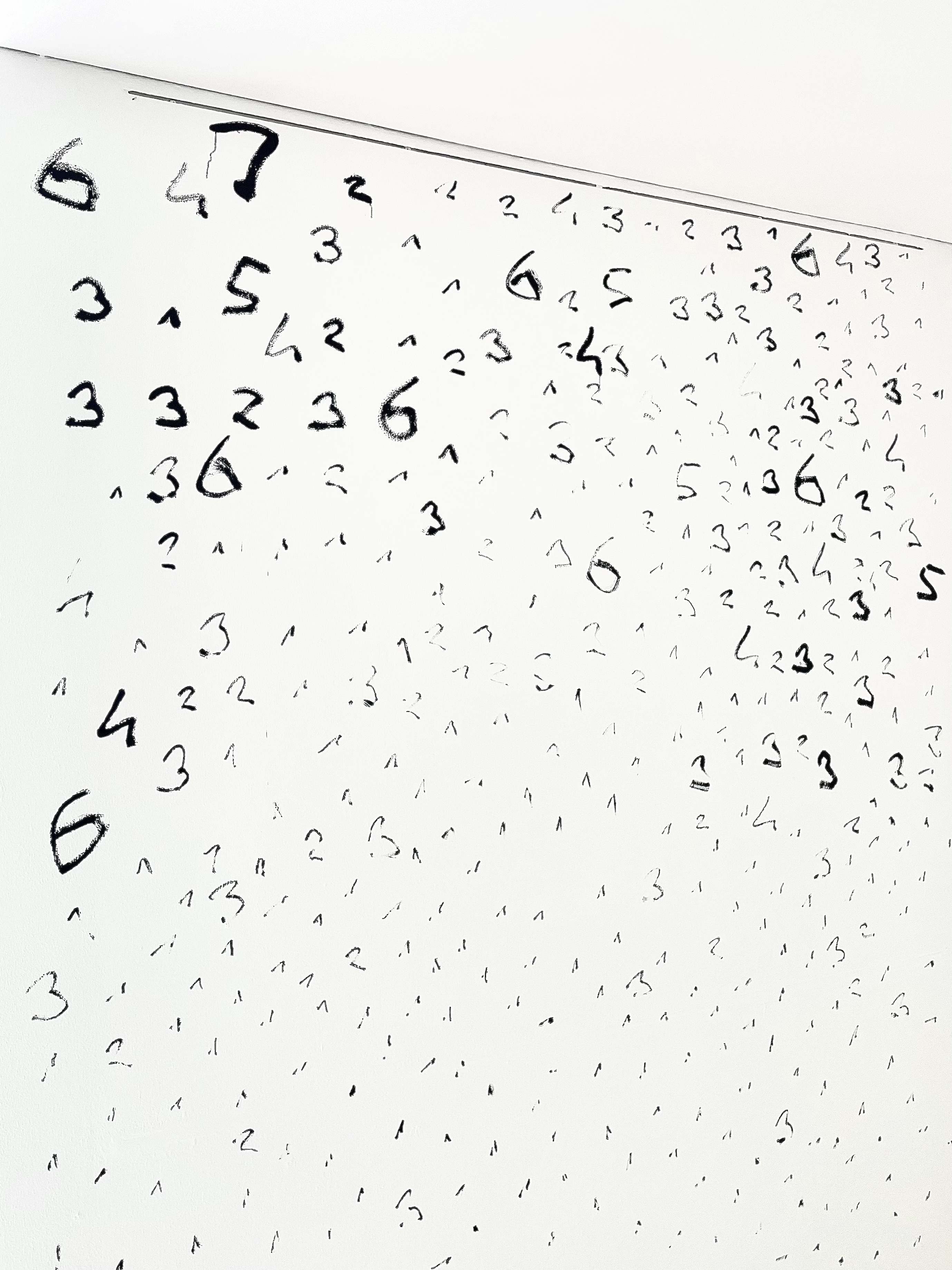
Oleksiy Koval, 2024
330 x 484 cm, ink on wall
Augsburg Contemporary
Before I apply the paint, I think about the movement:
how and where do I paint on the surface?
Oleksiy Koval, 2024
120 x 93 cm, ink on synthetic textile
Private collection Munich
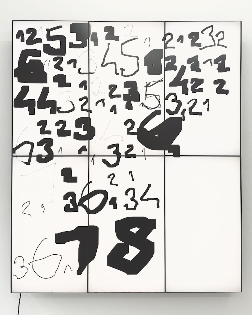
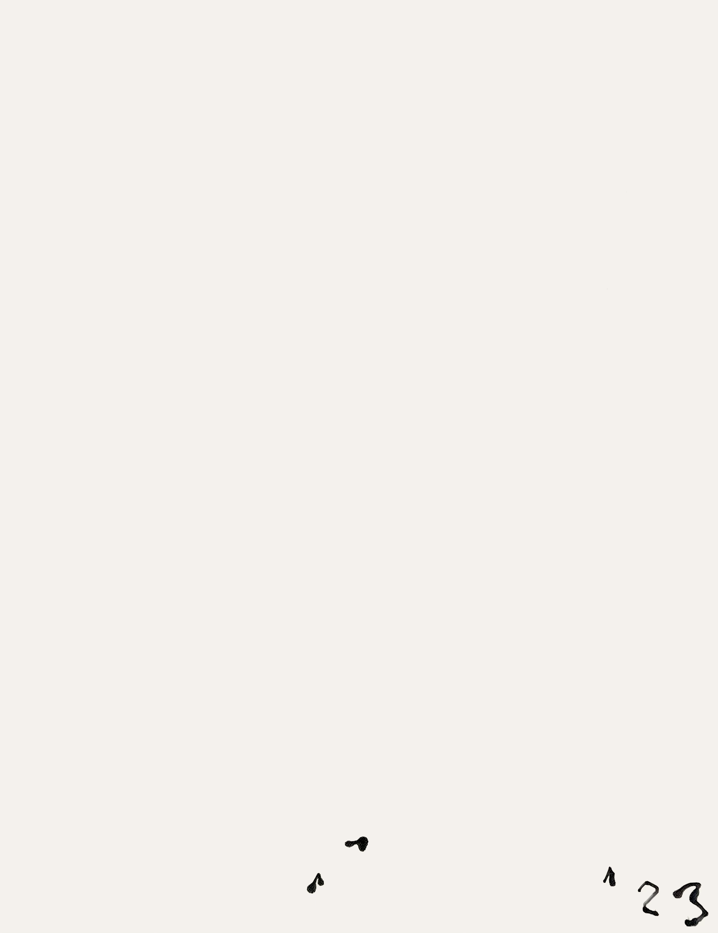
Unit, beat, and rhythm give form to the application of colors on a surface.
The basic unit defines the size of each type of mark on the surface.
1 is the smallest size of a mark, 2 is twice as big, 3 is three times as big and so on.
70 x 63 cm, marker on synthetic textile
Photo: Boxes Art Museum, Shunde 2025
If beat is a time grouping of touches on the surface, rhythm is an accentuation within the beats.
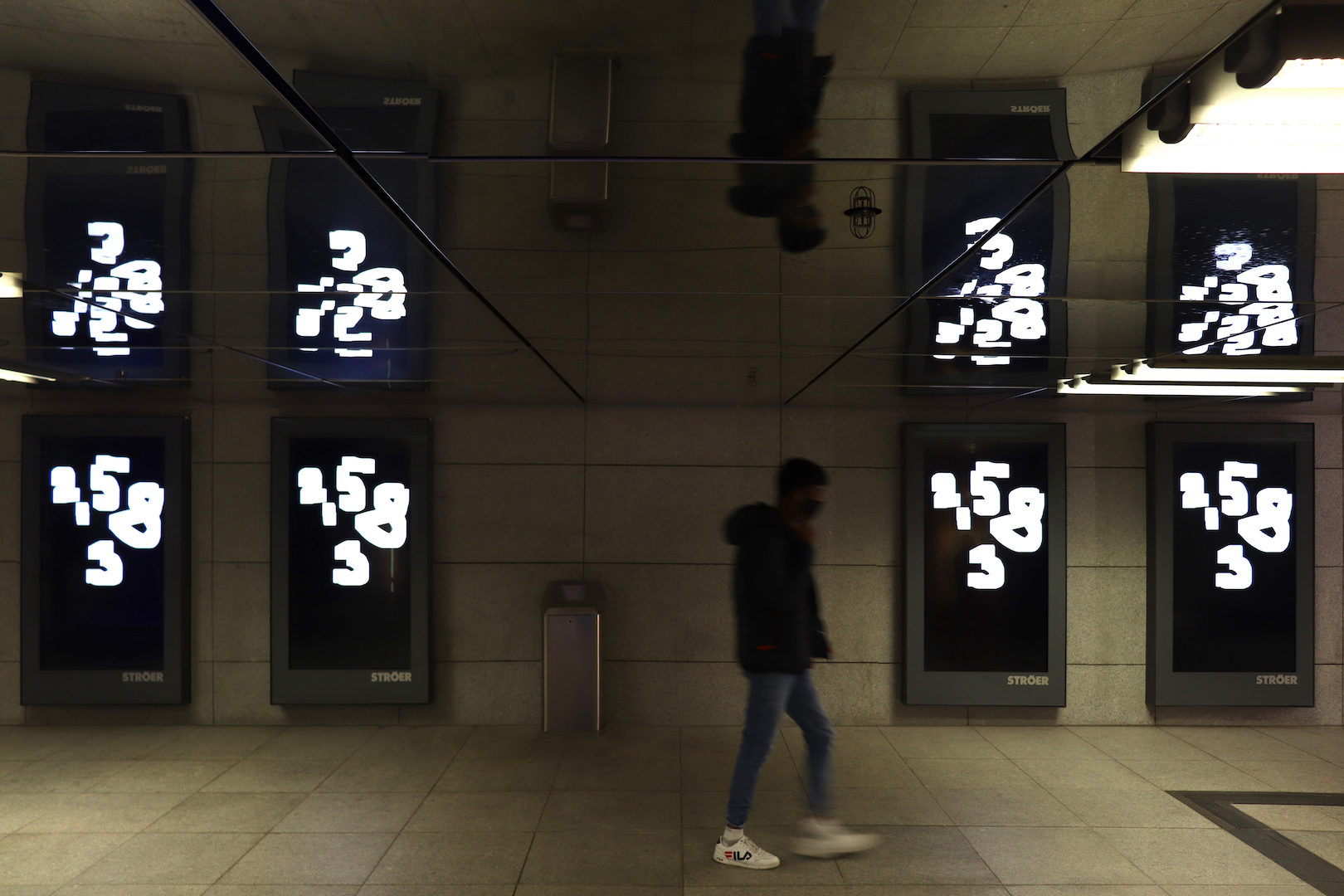
Oleksiy Koval, digital painting, 2020
Münchner Freiheit, Munich
A fixed sequence of units during a single entry is a rhythmical motive.

PNG, 102 x 116 cm, 2160 x 1920 px
Digital Art Space, Munich 2025
Rhythm is an essential tool: it makes the invisible visible in my painting — as rhythm made the invisible visible in the Byzantine Opus Vermiculatum and Opus Tessellatum.
700 x 350 cm, ink on wall. Kunstverein Augsburg
In his book Conversations with Cézanne, Joachim Gasquet quotes the French painter:
“ . . . It is necessary to be a good worker.
Nothing but a painter.
To have a formula and to realize it.
He looks at me, sad and sublime.
The ideal of heaven on earth . . .
is to have a beautiful formula.”